For my community map I wanted to go towards a “minimalist” look where the elements were clean and controlled. I thought simple geometric shapes and line work would be suitable for what I had in mind and the idea of using a singular colour or duo-tone as it is suppose to be simple and not overly complicated or detailed. This is because the workplace I am mapping is really white and has a “clinical” feel to it. This is due to the nature of the work and having to be clean and sterile so the meat is safe to eat and doesn’t make any pets sick. I researched a bunch of ideas from pinterest and found some ideas which I really like including transparent coloured circles against a black and white map and the watercolour effect which would provide a nice backdrop. A slightly more detailed idea following the bottom right was also considered where I could take a photo of an aspect within the place and merge it into a shape which can show off the actual place in the form of geometry.


Source: http://nz.pinterest.com
Search: Minimal map design
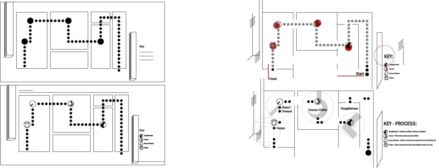
Below is my rough sketches and ideas, settling particularly on one idea which I believed was appropriate as a map. I also gave some thought towards the packaging as a plain box which is relevant to the workplace as they use plain boxes when packing the meat and incorporating the map within the actual packaging. I also thought about symbols which could used to signify the individuals within the community and to include a good amount of white space to bring emphasis towards the map and design.


I started off quite basic and developed the same map further by adding more features in and trying out different ideas. There were some ideas I wanted to do including an aspect of the place which I could shape in the form of a circle and placing within the map. I also wanted to make the symbols a duo-tone but as I was working in illustrator I couldn’t. However, depending on what is decided, I will throw the map into Photoshop and include some of the added features that I like the idea of. I did include one base colour to see what it would look like. I just wanted to create a basic map to work off before I went any further. The first two are secluded within a rectangular frame as this was to emulate the packaging itself before I decided to create the last two maps openly so that some features would carry onward to the box flaps if I were to choose that idea of packaging.


I liked your idea of including photography into your map. Are you still going to try this?
LikeLike
Yep I just used black dots as a template 🙂
LikeLike